This section explores the development for my brand identity. Also explored in this section is the establishment of my illustration style, as this will be a crucial factor in understanding what kind of work I hope to create and how this will strengthen the brand's overall coherency.

✺ DEVELOPING AN ILLUSTRATION STYLE 

MY ILLUSTRATION JOURNEY

I started by looking back at the illustrations I created in the first semester, as it was these experiences that have encouraged me to pursue illustration further. I observed that these illustrations were stylised, had an element of cute childishness to them and a strong use of colour. 
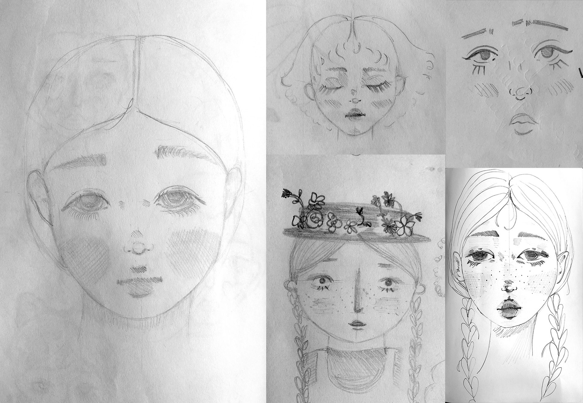
Feeling that the development of my own illustration style was being limited by only using the digital tool Procreate, I experimented with traditional drawing mediums such as pencil and pen on paper, to see if working in these mediums would bring something different to my illustrations and help me to discover my style. 
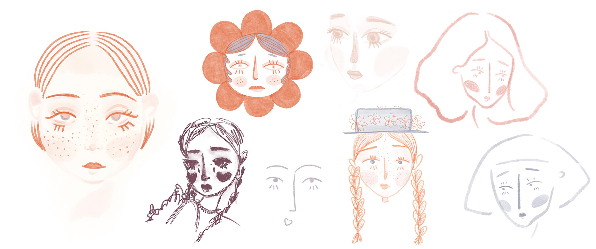
I started by drawing faces as I felt that people provide the most instant sense of character and style for an illustrator and make their work more easy to identify as theirs, as demonstrated by the distinctive styles of my illustration inspirations noted previously. I felt that if I could establish a style of person that I liked drawing, this style would then influence my illustrations of flowers and other subjects.
From an early stage, and in reference to my first illustrations created in semester 1, I knew I wanted my illustrations to have a core set of characteristics, including rosy cheeks, lower eyelashes, a somewhat sad expression and a particular colour palette. 
With this in mind, I illustrated faces in both traditional and digital mediums trying a variety of styles, including more minimal, contemporary line drawings and more intricate realistic portraits. 

FINALISED ILLUSTRATION STYLE
​​​​​​​
After illustrating faces for several days, I settled on a style that incorporated the earlier mentioned set of characteristics that I felt best defined my own illustration style. This style came the most naturally to me when experimenting, and I feel it has the right mix of stylised facial features without looking too childish. This style also incorporates the key characteristics I wanted to be included, and works in both more minimal sketches and more detailed illustrations with shading etc.

The next stage was to continue with my illustration practice, with this style of character in mind. This includes drawing objects, animals and full bodied figures. I also applied this drawing style to digital illustration using Procreate and tools like Photoshop and Illustrator, to see how these mediums will affect the overall look and feel of this drawing style.
Further illustration development is evident under the Creative Mini Projects tab.

✺ BRAND NAME DEVELOPMENT 
 
As I am launching the brand to be a personal portfolio showcasing my creative skills and interests across mediums, establishing a brand name that is reflective of my work was an essential component. 
I decided from the outset that I did not want to simply use my name for the brand. It didn't take much searching online to find that my name is used a lot on social media, so coming up with an original handle to use on these platforms would be a challenge. The vast majority of illustrators I looked at do use their own names, which is understandable in their commercial settings, such as publishing. On the other hand, florists and flower brands do the opposite, favouring a creative brand name over the name of their designer/founder. 
I felt that the better direction to take for naming my brand would be to try to find words or combinations that convey the types of content I aim to create through the brand. I started by creating long lists of key words relating to a few themes of interest: Flowers (flower names and terminology), Nature (nature words, such as plants, animals and fruits), Storytelling (words that have a narrative, whimsical feel) and personal references such as my red hair and freckles.
 The naming process was quite challenging, as with the floral theme that will run through my brand, the obvious choice would be to use words relating to flowers and nature. Flowers are an inoffensive subject matter and universally popular, with both personal accounts and brands using flower words and terminology to name their profiles. This resulted in almost every variation I could come up with being unavailable on social media. Well known flowers with simple spellings and nice sounding names such as poppy, daisy, rose and violet are over-used on social media, but flowers with more unusual names and spellings lack memorability or impact. 
I played around with combining floral related words with other words and themes. These combinations included using whimsical, storytelling feeling words and my initials ES. Some examples can be seen below. 
Once I had come up with a selection of names, I consulted with a small group of friends throughout to get their thoughts and opinions on the names. Their feedback was valuable as they were able to point out issues that I couldn't see without taking a step back from the process. These issues included confusion on spelling, lack of memorability, and being overcomplicated with regards to the meaning of the brand name. 
Two names I shortlisted were Flower Freckles and Wallflower Wild. I felt that these names had a nice sound, evoked a romantic, storytelling quality and had the potential to be more like a 'persona' for myself as the artist. Freckles is a direct reference to myself, and Wallflower is an accurate description of my introverted personality, whilst also having the floral connotation. 
The issue with these names is that they are quite long, the double 'W' in Wallflower Wild is difficult to pronounce aloud and Flower Freckles may not lend itself well to less playful illustration styles I might want to try. 
Using flower-centric branding also risks limiting the direction I can take the brand in the future or sound too much like a florist than a design brand. As I hope to continue to make projects after graduation, having a name too floral or literal may not suit future projects if I decided to change style or no longer use botanical elements. 
Moving away from flowers so not to limit my options, I also considered words for colours and fruits that may suit the brand. Other names including Paper Lemon, Tiny Plant Press and Design by Freckles were ideated. In these instances, similar brand names existed and social media handles would be inconsistent across channels. 
The simplest names I came up with were always unavailable, leading me to make more complicated names. While these names were available online, they were prone to being forgettable and confusing. 
Having ruled out using my full name as my brand from early on, but still feeling unsure on the other naming choices I came up with, I decided to look at my name in a bit more detail. I experimented with acronyms of my full name but this produced nothing interesting. Emma is a common name that is already used for several brands and creatives. My surname, Savage, is also popular in current vocabulary and has its own connotations that simply don't suit my brand.
The last option I had was to look more closely at nicknames and abbreviations of my name that have been used over the years. Emsie came to my attention as it has a friendly, youthful sound that reflects the colourful and characterful works I hope to create. I wasn't expecting the name to be available on platforms when I looked into it, but research exposed that the variation @emsiestudio was available on every platform. This meant I was able to have an identical username on all social media and my website without needing to water it down with other symbols, characters or numbers. There are no existing creatives working under the name Emsie which also reduces the risk of confusing my brand with someone else. 
Using Emsie as the brand name also eliminates my concerns for the future, as the brand name is more versatile and less restricted to content of a purely floral theme. 
What I learned from this naming process is the importance of simplicity and not overcomplicating. I was so keen to have a name with meaning, but understand now that from the consumer perspective, it is more important that the name is simple and memorable than steeped in meaning or symbolism. 

CREATING A PROFILE PICTURE
 ✺
In order to be able to start sharing to social media without needing to complete my branding and logo first, I wanted to create a profile image. As it will be seen at a small size, I played around with a few designs. The aim was also for the display picture to provide a snapshot into what kind of illustration style and content people can expect to see.
Pencil Sketches of first ideas for Profile picture
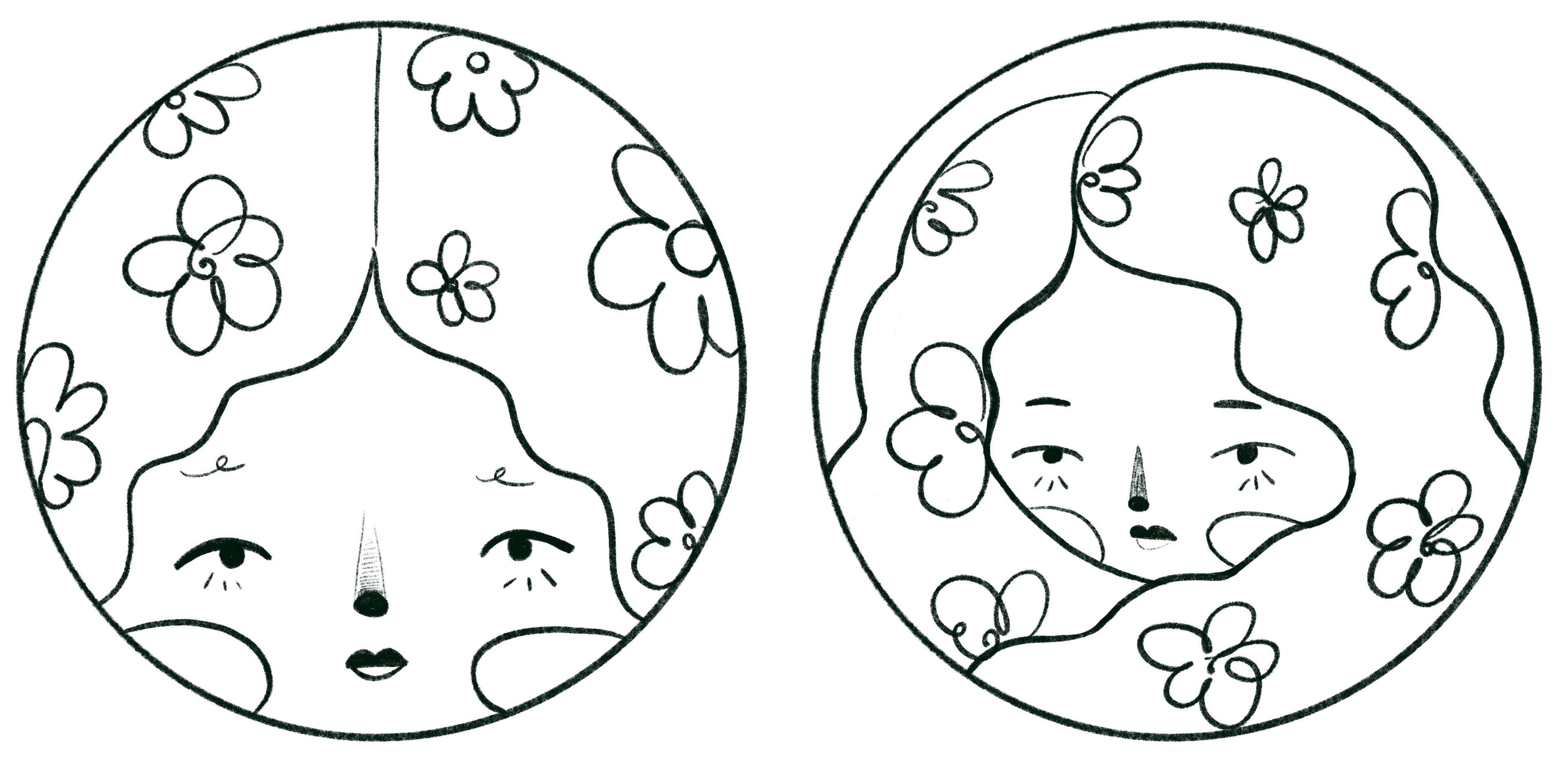
Digital Sketches of potential profile pictures

VERSION 1

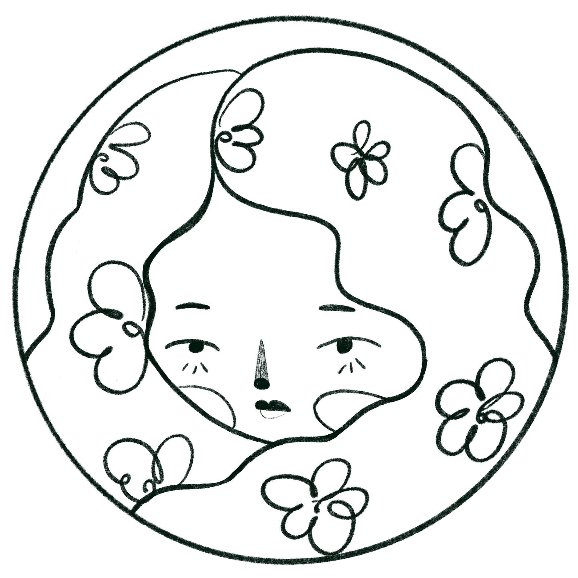
Version 1. While I liked the colours and overall concept of this design, when scaled down to the smaller size of a profile picture on Instagram, it didn't look right. I think this is because the face blurred entirely into the circle shape which didn't translate well on a small scale.

VERSION 2

Time-lapse video of profile picture development
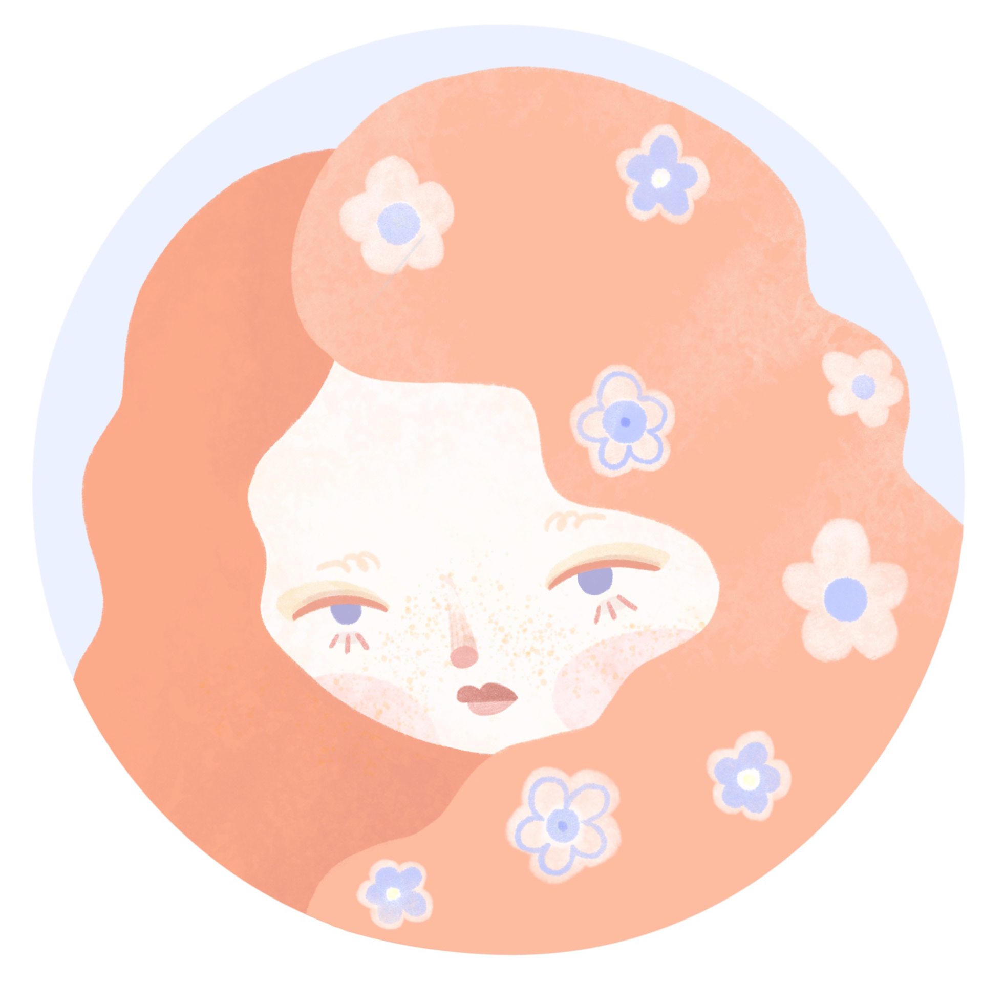
I then moved on to my second variation and experimented with this design. I found that by rotating the original sketch slightly, it created a better composition, and looked as though the subject was looking over her shoulder a bit more. I played with a couple of colour variations before making a final decision. 
Experimentation of colours can be viewed while watching the video time lapse below, where I would adjust the hue and saturation until I found colours that complimented each other well and would have the right contrast to be viewed at a small size. Initially I preferred the pastel blue as it is more feminine and dreamlike, however details were lost when uploaded as a small scale profile picture. The dark was definitely an improvement, but the background shade was a bit too de-saturated and looked dull.
FINAL PROFILE PICTURE

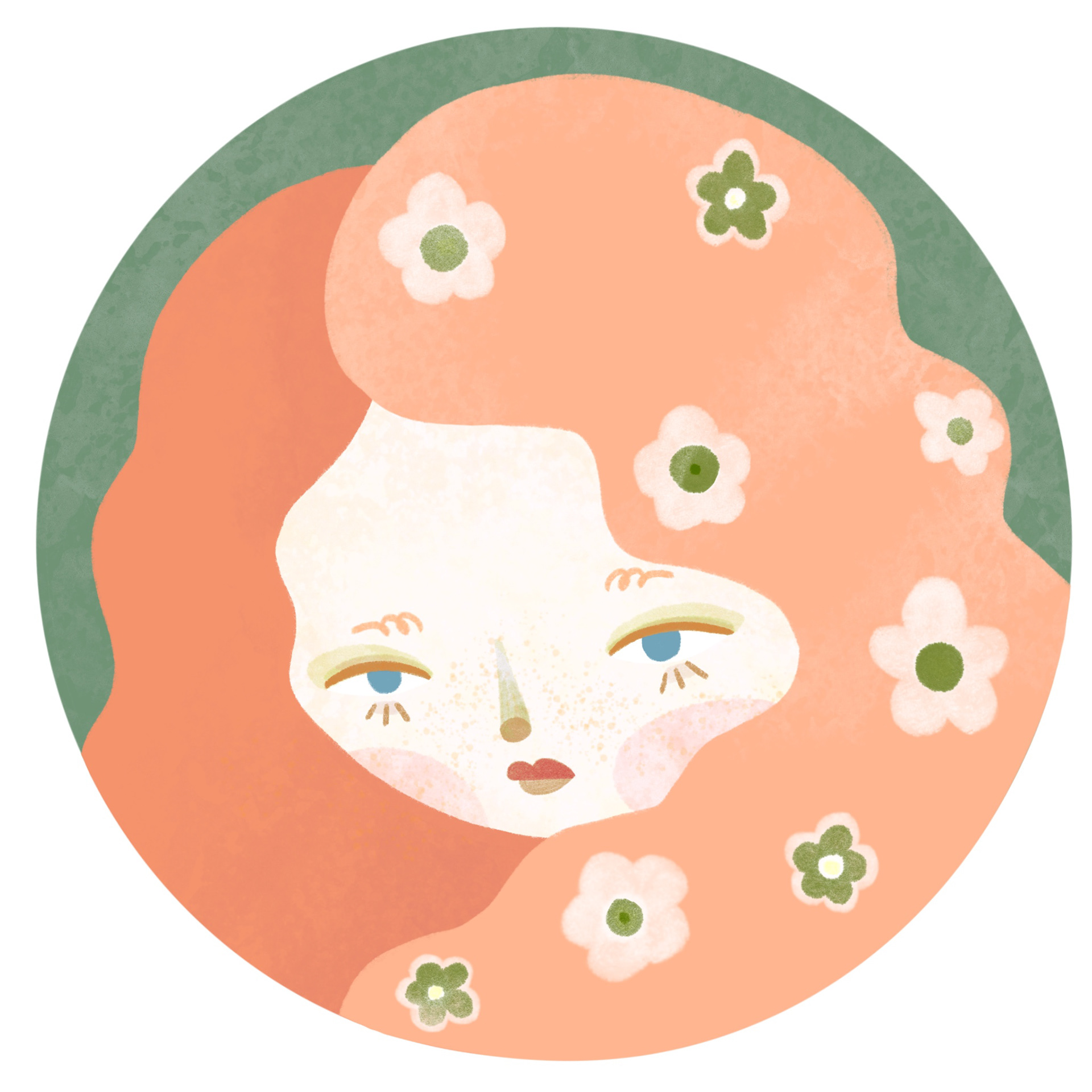
 The final profile picture is a good representation of my overall design style, by using a female figure, distinctive, slightly moody facial expression and a colour palette that ties in with my illustration style. The use of simplistic flower shapes translate well on a small scale and it isn't overly embellished with small details.
While I was originally thinking of using pink for the hair colour for a more pastel, feminine feel, by using orange, the figure has a resemblance to me as a redhead and is more representative of Emsie as a personal brand. Orange is also complimentary to green I chose for the background and flowers. I incorporated the olive green shade that appears regularly throughout my illustrations.

 COLOUR PALETTE 
As a commercial designer, being able to work with different colour palettes to my own personal taste or style will be a requirement. As a personal brand however, as Emsie is, a particular colour palette is an instantly recognisable asset when establishing myself as a designer.
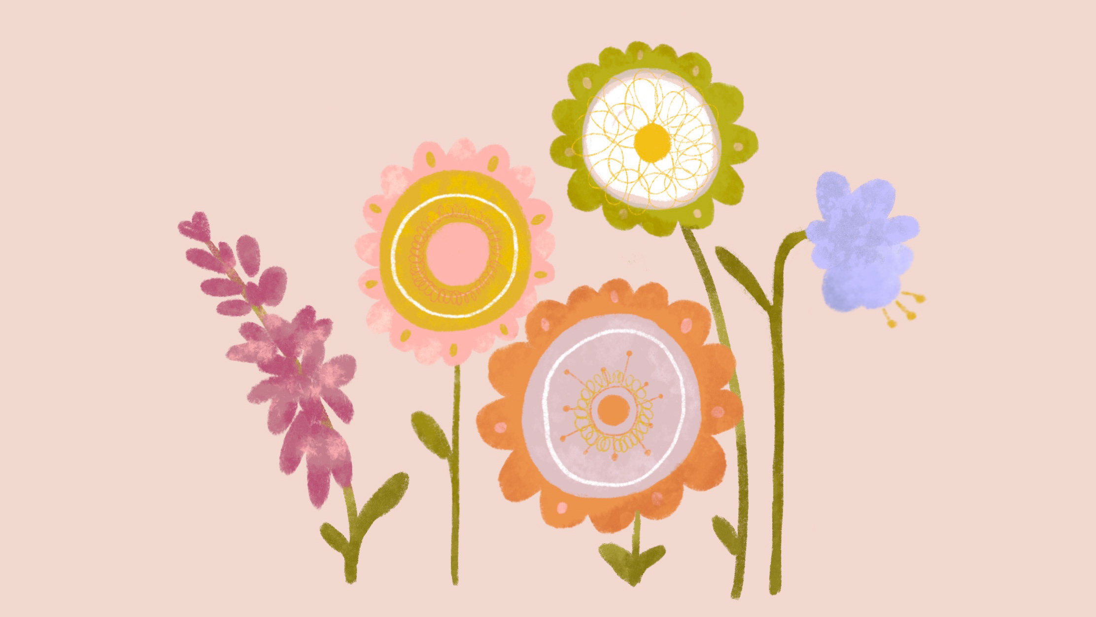
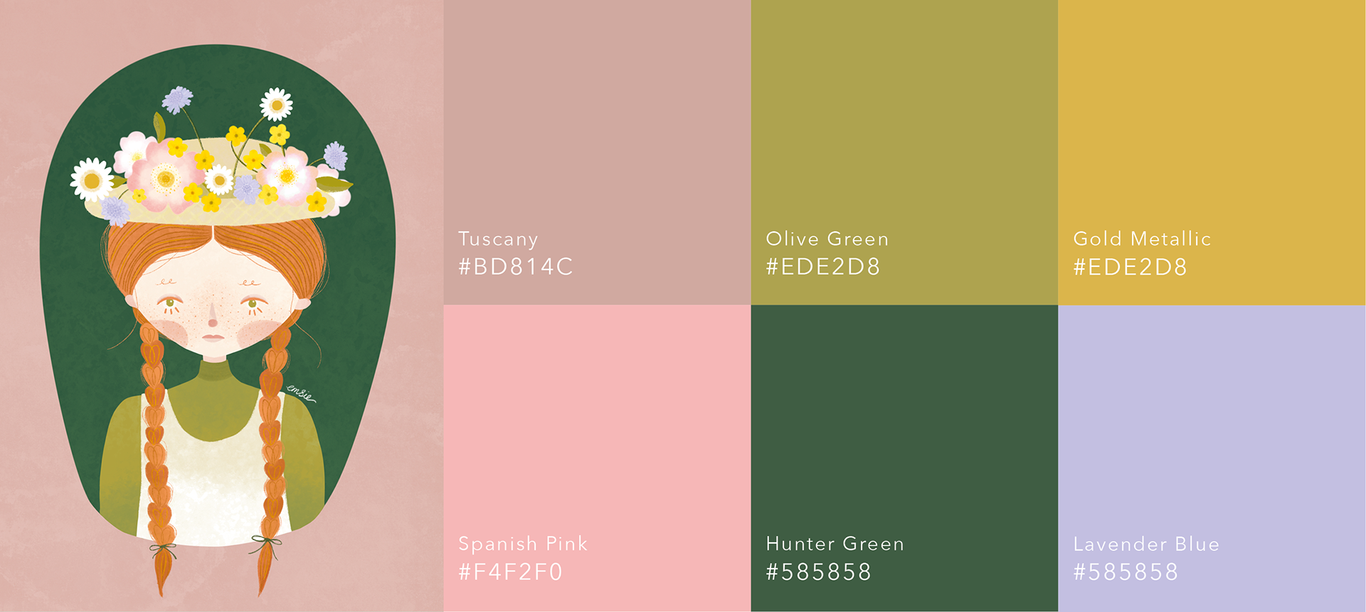
It wasn't until I started my first illustrations as part of my mini projects that I started to notice recurring colours within my work. This is evident in some of the illustrations I did in the earlier semesters too, where I used lots of earthy, warm and organic colours such as dusky pink, mustard and green to communicate the calming and sustainable elements of those projects. These colours shaped the palette for my brand for this final project, but I also incorporated more pastel shades to build a feminine and calming selection of images that looked visually appealing together when presented on my Instagram profile grid.
This variety of colours is also reflective of the variety in the world of flowers, and the colours I use will often be decided based on the flowers being referenced.

EXAMPLES OF ILLUSTRATION COLOUR PALETTES
​​​​​​​
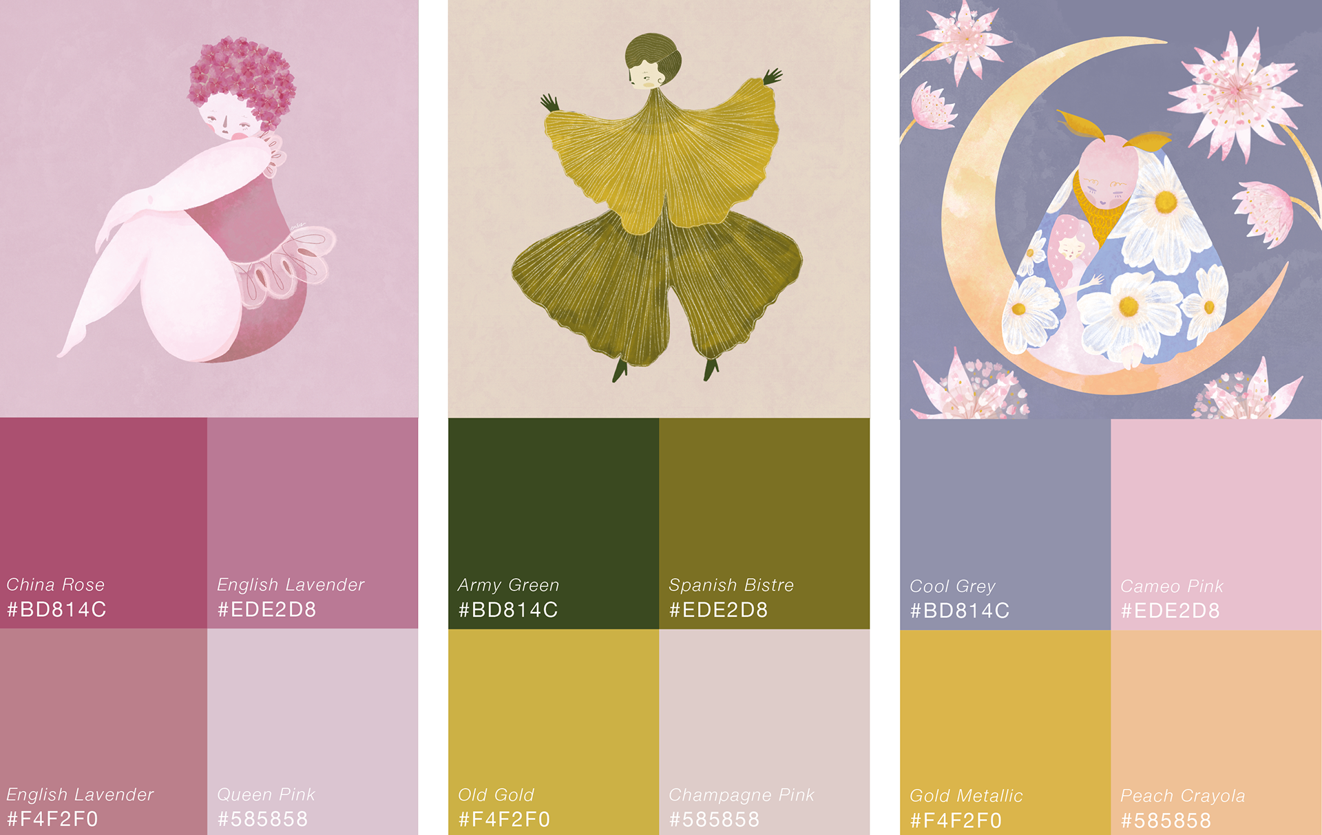
The following is an example of how I have utilised colour throughout my illustrations this semester.
You will notice in my Anne of Green Gables illustration, the majority of core colours I use regularly feature in this work. Colours are desaturated to maintain a muted, calming tone and a feeling of nostalgia. If I used saturated, more vibrant colours, I feel my designs would take on an entirely new identity, and not have the peaceful, whimsical qualities that my audience has commented on.
The core colours I refer to are dusky pinks, olive and dark green, mustard yellow and pastel shades like lilac. 
Referencing colour theory, I have found that most of my designs follow a 'complimentary' palette. 
Another palette that works well with my illustration is the 'monochromatic palette', or the introduction of an accent colour. For example, my Hydrangea lady uses a monochromatic palette of pinkish purple. The Ginkgo series works with earthy greens to golds, with an accent contrast in the form of the champagne background.
✺ LOGO 
I am yet to create a logo for the Emsie brand, instead prioritising a profile picture for my social media channels and establishing a clearly identity for my illustrations. Development of a logo was not essential for me to start sharing my work online, and I will create a logo as soon as possible so that it can be used to strengthen Emsie as a brand and be used on my website and any marketing collateral that may be created in the future. 
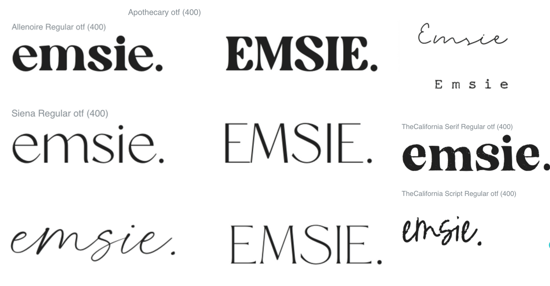
 I experimented with a few fonts from Adobe Typekit, and settled on New Spirit to be the temporary Logo font for Emsie. 
Reading the New Spirit's font description on the designer's website also matched very well to Emsie's design traits and it seemed a fitting choice to act as my logotype at this time. New Spirit complements natural themes and I liked how the font has a slightly retro feel. Its form is soft and does not contradict the illustrations being shared. 
"Like a half-remembered dream—entirely familiar, sort of comforting, but which can’t be pinpointed to a particular time or place — New Spirit is both nostalgic and entirely enigmatic.
New Spirit is a revival of Windsor, a typeface release in 1905 by Stephenson, Blake & Co. The rework finally does Windsor justice across a thoroughly designed and useful range of weights; cementing its place as a 21st century icon, not just a curious relic of the 20th. It’s an Arcadian typeface, by which I mean that it is from an artistic vision of stability, abundance and harmony with nature. This sense of the organic, homemade and untainted by industry brings an undeniable romance, tempered by its traditional aspects in nods to more conservative Oldstyle serif typefaces."
Creatie Market has a selection of fonts that may influence Emsie's future logo, but as you must pay for Creative Market fonts, I will use Adobe Typekit for now.
New Spirit is an Adobe Typekit font and will be Emsie's logo type for now.

 TONE OF VOICE 
As a personal design brand, my tone of voice for Emsie will be reflective of myself as much as possible.
The aim is to build genuine relationships with my followers on social media, and this will require a welcoming, personable space on my platform. The core tone of voice I am using for the Emsie brand are:

Personable & Authentic:
This tone can come across effectively on social media, where audiences seek a personal connection to brands. My interaction mainly comes via social media, which is a great way to connect directly with my audience. 
I will communicate this tone of voice by reaching out regularly to others, such as following back, liking and commenting on others posts and responding promptly to comments I receive. I can also share insights into Emsie’s day-to-day that are not specific to my art and design, such as walks in nature with my dog, or behind the scenes flower related content and flower facts.
Lighthearted & Positive:
Emsie’s Instagram account is a carefully curated, safe space for her audience to find peaceful, cheerful designs. Using humour, a play on words and positive quotes are all effective techniques and are reflective of the personality of my illustrations. I can also enhance the personality of Emsie’s illustrations by creating cute animations, descriptive captions and playful interactive elements.
Romantic & Nostalgic:
Emsie aims to tell stories through its designs, from developing characters to sharing flower facts or folklore tales. The brand is influenced by the romance of flowers and nostalgia, drawing inspiration from days gone by, and an appreciation for simple things. I can communicate this tone by using articulate and storytelling language, sharing stories and folklore that has inspired my designs. This can be put into practice by accompanying works with narratives and short stories in their captions, allowing the audience a greater emotive resonance with Emsie’s designs.

✺ MUSIC CHOICE 

As an extension of tone of voice, music is an important part of how I communicate the Emsie brand.
With video a popular medium on social media, and through the creation of Reels, TikTok videos and Instagram Stories, music can accompany the content I create to enhance the mood and energy of the designs being shared. Certain song lyrics or titles can also reference the artwork, for example, I used Donovan's song 'Catch the Wind' for my Anemone video, as not only was this a retro, romantic song, but also reflective of the story behind the Anemone and its other name 'Japanese Windflower'.
The music choices I made for Emsie are reflective of the tone of voice I aim to communicate, particularly the romantic, nostalgic and positive tones. 
Examples of this include:
Romantic: Calming, classical music such as piano makes the videos relaxing and pleasant to watch and reflects the dreamlike feel of the visual content
Nostalgic: Drawing on my love of music from the 60s to 80s eras, using these genres of music will strengthen Emsie's identity that goes against using current music trends that don't fit with my illustration style. With art inspired by vintage fashion and slow living, the music and lyrics of these eras compliment the works I have been creating for this project. 
Positive: Use popular contemporary music that is fitting of the brand. These artists include Celeste and Harry Styles, who while their music is popular today, their sound still has a timeless, nostalgic influence.

Below are two examples of how music is used in my videos. If there is any problem viewing or hearing the videos, you can view them on Emsie's Instagram page here (opens new tab).

The 1965 song 'Catch The Wind' by Donovan accompanies my Anemone video. This song reflects the romantic and nostalgic tone and giving a relaxing vibe as well as referencing the anemone's other name 'windflower'.

Modern popular songs can enhance exposure, particularly on platforms like TikTok. I used Harry Styles - 'Treat People With Kindness' for this video as it has a fun, upbeat sound but still a nostalgic quality. It also worked well rhythmically to the video clips. 

 BRANDING CONCLUSION 
Unfortunately, due to time constraints, I haven't been able to explore my brand strategy as thoroughly as hoped. This is due particularly to needing to have established an illustration style and voice for my brand and to start sharing work on social media to build a following. Prioritising these steps will equip me with the brand knowledge that would inform building the whole package of branding materials and create a more coherent brand in the long run. 
The final Brand Guide of progress made so far can be viewed on the Final Outcomes page.


CLICK BELOW FOR THE NEXT PART OF THE PROJECT:

You may also like

Back to Top