✺ ABOUT THIS PAGE ✺​​​​​​​
On this page I will summarise each of the creative mini projects I undertook to build Emsie's brand portfolio and social media with. These projects all have their own processes behind them which will be explained and documented, such as moodboards, sketches and supporting research.
Please note: Due to the large amount of image and video content associated with this project, I couldn't put everything on this page. Each mini project has its own Google Drive folder containing all materials from each project, if you would like to see more. These folders can be accessed via the 'VIEW ALL FILES' button under each project (opens in new window). 
In order to showcase the multiple creative disciplines I hope to with this brand, I assigned myself a selection of creative mini projects. I had many ideas for what I would like to create, however time constraints required me to focus on a small selection of no more than 5 projects. I have outlined 4 creative mini project briefs, with an optional 5th that will be completed if there is time.
The aim of these mini projects is to allow me to experiment with different mediums and explore the use of florals within art and design. The mini projects also hope to demonstrate how both my creative disciplines and the use of florals can be applied to a commercial context to add a more professional dynamic to my portfolio. I will be prioritising illustration for these projects, but hope to integrate other mediums including photography, floral design and content creation for social media.
Each mini project would start out with traditional pencil sketches for ideation before being uploaded to Procreate to be digitally illustrated. I also referred to online sources such as Pinterest and Instagram to source inspiration, although I tend not to look at other illustrators work too much during designing, as there is a risk of being too influenced by them rather than honing my individual drawing style and brand identity.

 CREATIVE MINI PROJECT BRIEFS 
PROJECT 1. 
ILLUSTRATION |  'FLOWERS FROM MY GARDEN' SERIES
Creative Discipline: Illustration (Digital and Traditional)
Time to complete: 2 weeks
Description
Create a series of illustrations as part of launching the brand on social media. Subjects may include people, animals, objects and fashion but will all have a floral theme running throughout. Illustrations can be created using a combination of observational (drawing from life or references) and ideational (drawing from imagination). The project is an exploration of ways of using floral motifs in art and design.
The purpose of this project is to allow me to get familiar with illustration by continuously working on honing my technique and individual style, while requiring me to start sharing work online and seek exposure. This project will also act as a warm-up exercise for the latter illustration projects that will require a greater competency in illustration that I simply won't have without practicing illustration.
Create 6 finished illustrations to be shared on Instagram.
PROJECT 2.
BOOK & CHARACTER DESIGN | ANNE OF GREEN GABLES
Creative Discipline: Illustration & Graphic Design
Time to complete: 2 weeks
Description
Create a book cover mockup for the classic novel Anne of Green Gables by L.M Montgomery. In addition to the book cover, a series of illustrations showcasing character design or key scenes will also be created.
This project will allow me to tap into the online fan following of the Netflix adaptation Anne with an E, as well as working with popular themes and aesthetics like Cottagecore, all of which are popular on social media and can help with gaining exposure for the brand.
The purpose of this mini project is to challenge myself to apply my new illustration skills to a publishing context, requiring me to consider the target audience and the use of illustrations in literature. 
PROJECT 3.
REPEAT PATTERN DESIGN 
Creative Discipline: Illustration & Graphic Design
Time to complete: 2 weeks
Description
 Create a floral pattern using digital illustration. This design will need to be a repeat-pattern, allowing for it to be applied to a final outcome such as printing onto fabric, gift wrap or product packaging. Apply the finished design to a mockup product to show the pattern in context. 
The purpose of this project will be to refine my technical skills to be able to adapt my illustration and designs towards commercial settings and ensuring that the work I create is suitable for printing.
PROJECT 4.
MIXED MEDIA PROJECT | DIGITAL COLLAGE
Creative Discipline: Photography & Floristry
Time to complete: 2 weeks
Description
Create a package of social media content using flowers as the primary medium. Use my existing experience as a florist to design and create a selection of floral designs. Photograph the flowers in a creative way and generate other social media content such as video. Create imagery that taps into current design trends like Cottagecore.
The purpose of this project is to demonstrate my other creative skills and add more variety to my brand's portfolio. This project will demonstrate strengths in composition, styling and creating visually appealing content for social media.
PROJECT 5.
RHS CHELSEA FLOWER SHOW / CHELSEA IN BLOOM
(OPTIONAL)
Creative Discipline: Illustration & Floristry
Time to complete: 1 week
Description
Celebrate September's RHS Chelsea Flower Show by creating an illustration in honour of the show, such as a poster design or animated content for social media. This project can be complimented by a floristry project that can be created and photographed if there is time.
Share content to social media using relevant hashtags to reach the target audience.
✺ PROJECT PROCESSES 

PROJECT 1. 
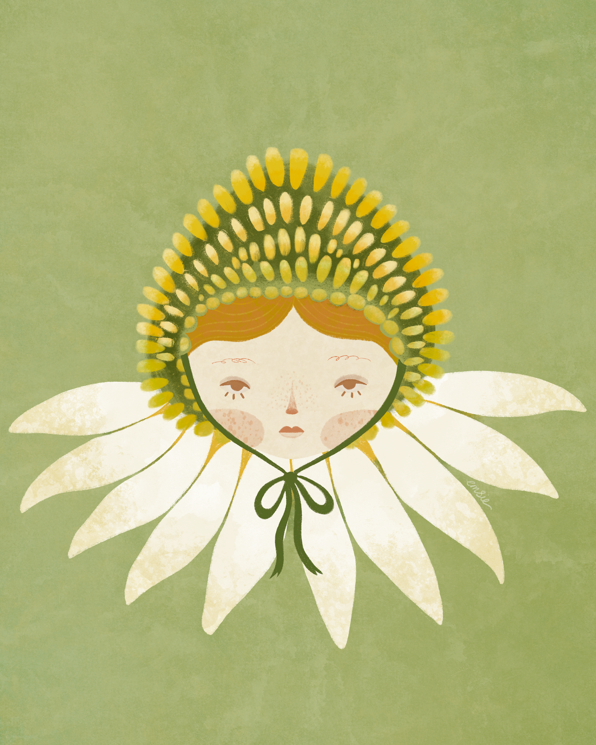
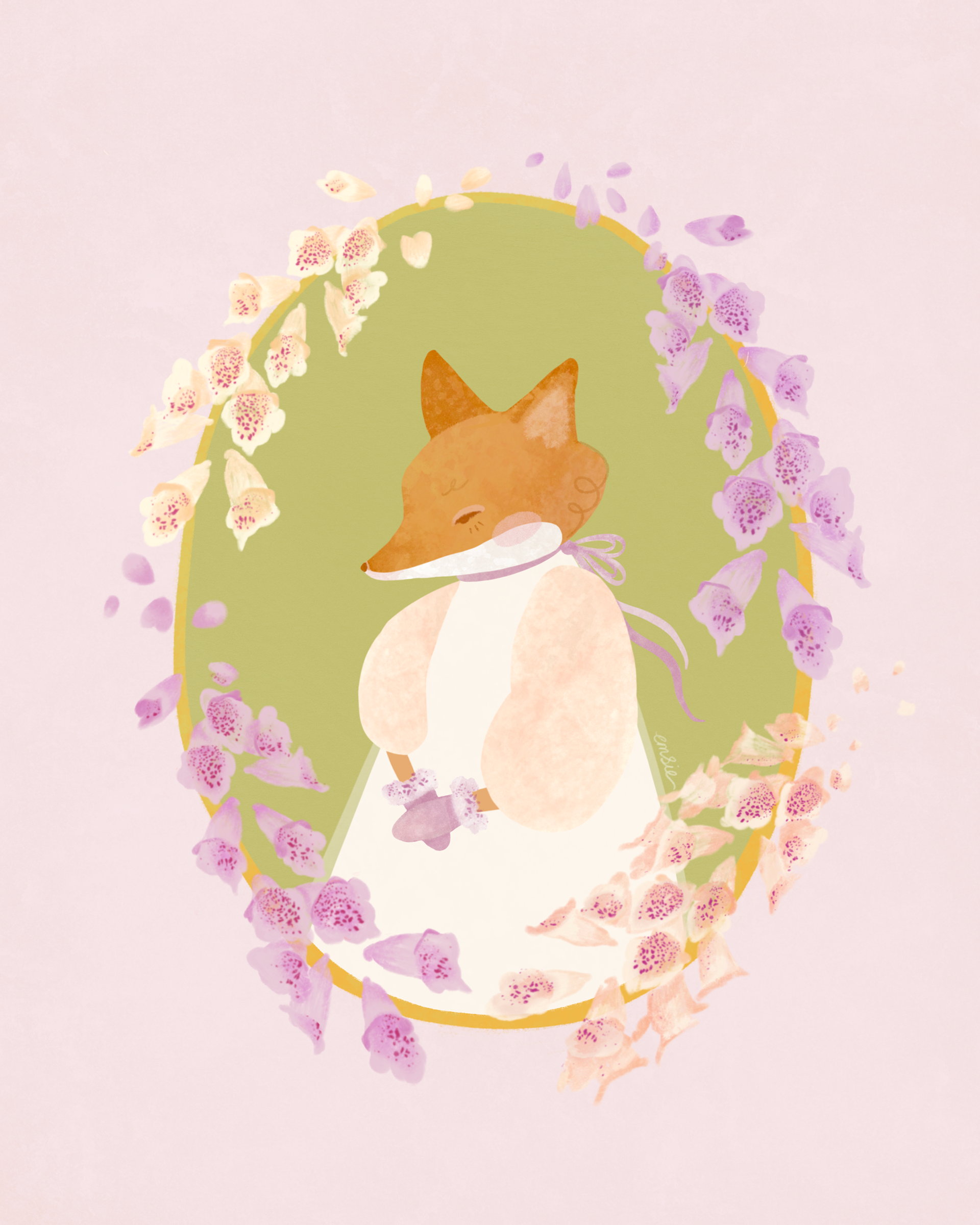
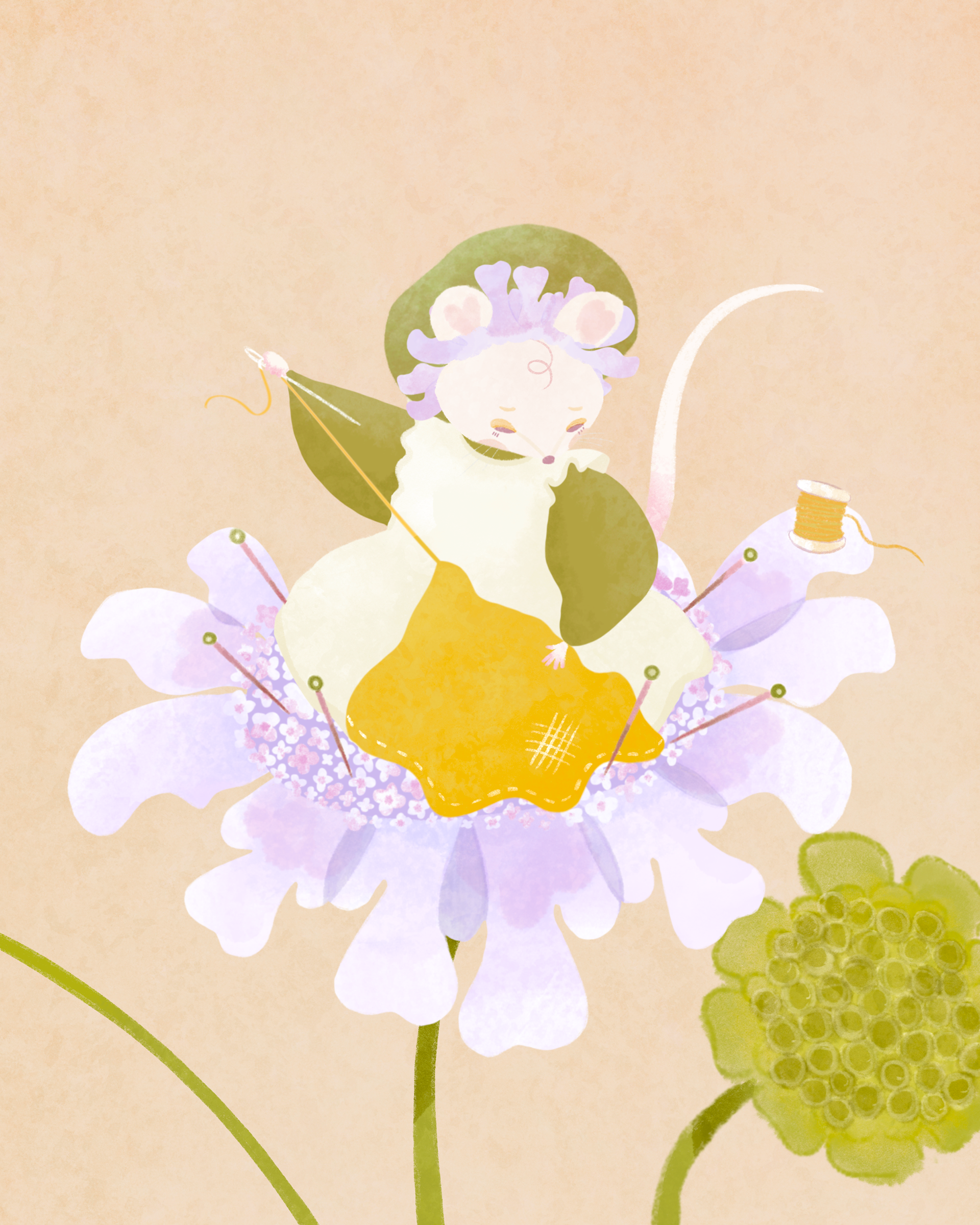
ILLUSTRATION |  'FLOWERS FROM MY GARDEN' SERIES
The first mini project I created aimed to challenge me into drawing regularly and with different subjects, while maintaining a floral theme. Needing to share work to social media, I wanted to have at least 6 images ready to share to Instagram in order to start building a social media presence as quickly as possible and not have an empty profile.
With the summer months comes an abundance of flowers, and we have several varieties growing in my garden at home. I felt this would be a good place to start as it provides me with a free source of flowers to utilise and was always accessible. It also encouraged me to create my own references, rather than working entirely from secondary sources online. I took my own photographs of flowers to act as primary references, particularly when familiarising myself with a flower’s form and texture. I also shot video footage wherever possible with the aim to use some of the clips on social media or to compile video content for Instagram Stories, Reels and TikTok. ​​​​​​​
To help with the ideation process, I researched into each of the flowers I hoped to use and made a final selection based on how well I could communicate a narrative for each flower. Drawing on the vintage illustrations and stories of female writers and artists, Beatrix Potter (Peter Rabbit series) and Cecily Mary Barker (Flower Fairies), the project combines flowers with other subjects such as people and animals. This was to challenge me with drawing different subjects, and stopped me from limiting myself too much.​​​​​​​
The Flower Fairies illustrations show each fairy dressed as the flower they represent, and Beatrix Potter is famous for her characterful animals dressed in clothes. These are both concepts I was influenced by for this mini project.​​​​​​​

FLOWER MEANINGS, SYMBOLISM AND IDEATION

Examples of some photographs taken of flowers in my garden, inspiring this first mini project.

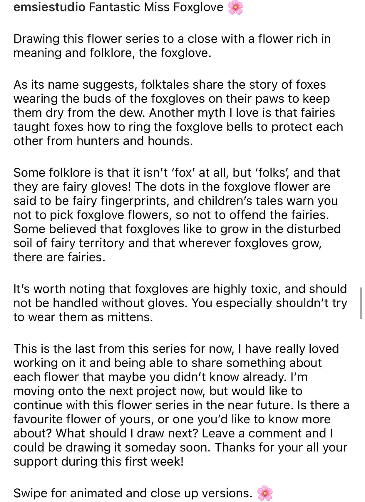
For my illustrations, I researched into the symbolism, folklore and meanings of the flowers which guided me into creating an overall concept for each drawing. 

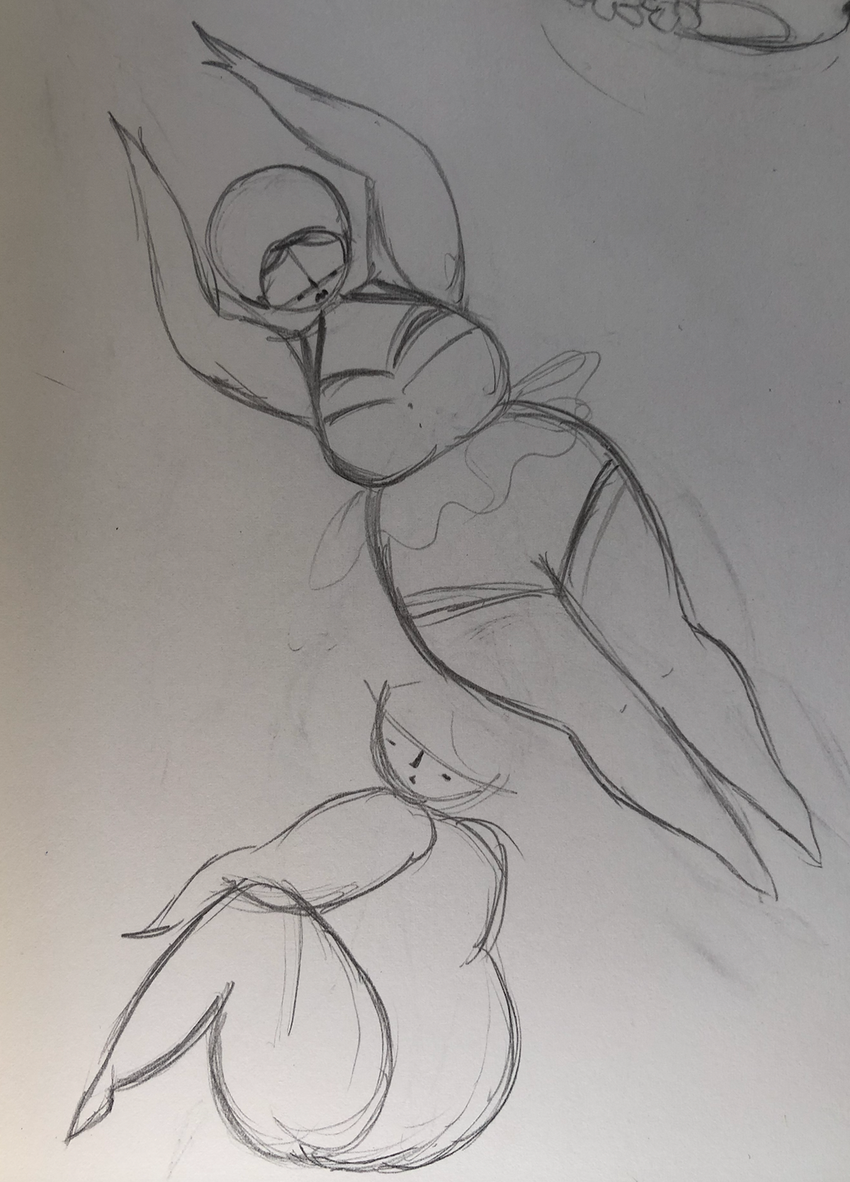
First sketches created based on my research of each of the garden flowers and their meanings and connotations

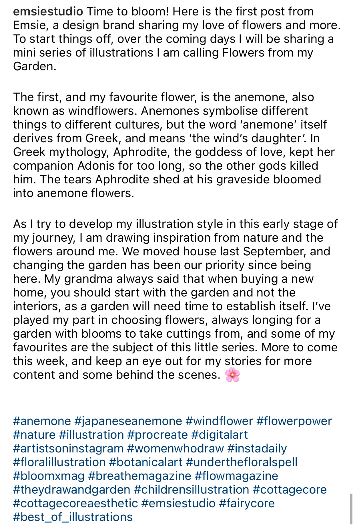
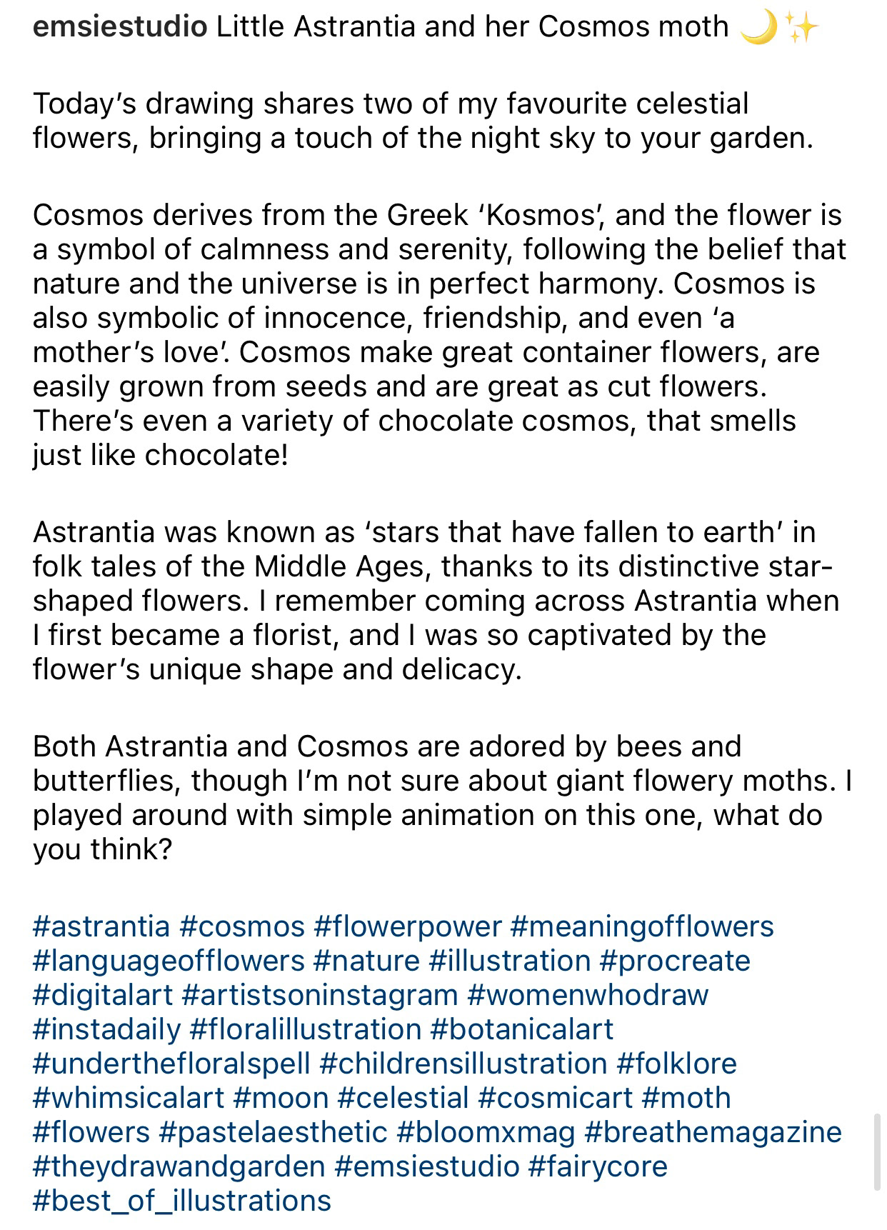
As you can see in the time-lapse video here, most of my drawings begin as pencil sketches. I then photograph the sketch and use it as a rough guide to create the artwork in Procreate. 
Most of my decisions are made based on trial and error whilst using Procreate, including an experimentation of different colour variations, textures and moving features around. 
I hope that as I become a more confident illustrator, I will be able to create works without needing to experiment with colours and techniques with as much uncertainty, as this will make me faster as a commercial designer.
A link to more time-lapse videos is at the bottom of this page, if you want to watch more drawing processes.
Above: Example of my step by step process for this project.
Right: Animation of layers that combine to create the final illustration.
Above: Experimenting with monochromatic and complimentary colour palettes whilst designing in Procreate.

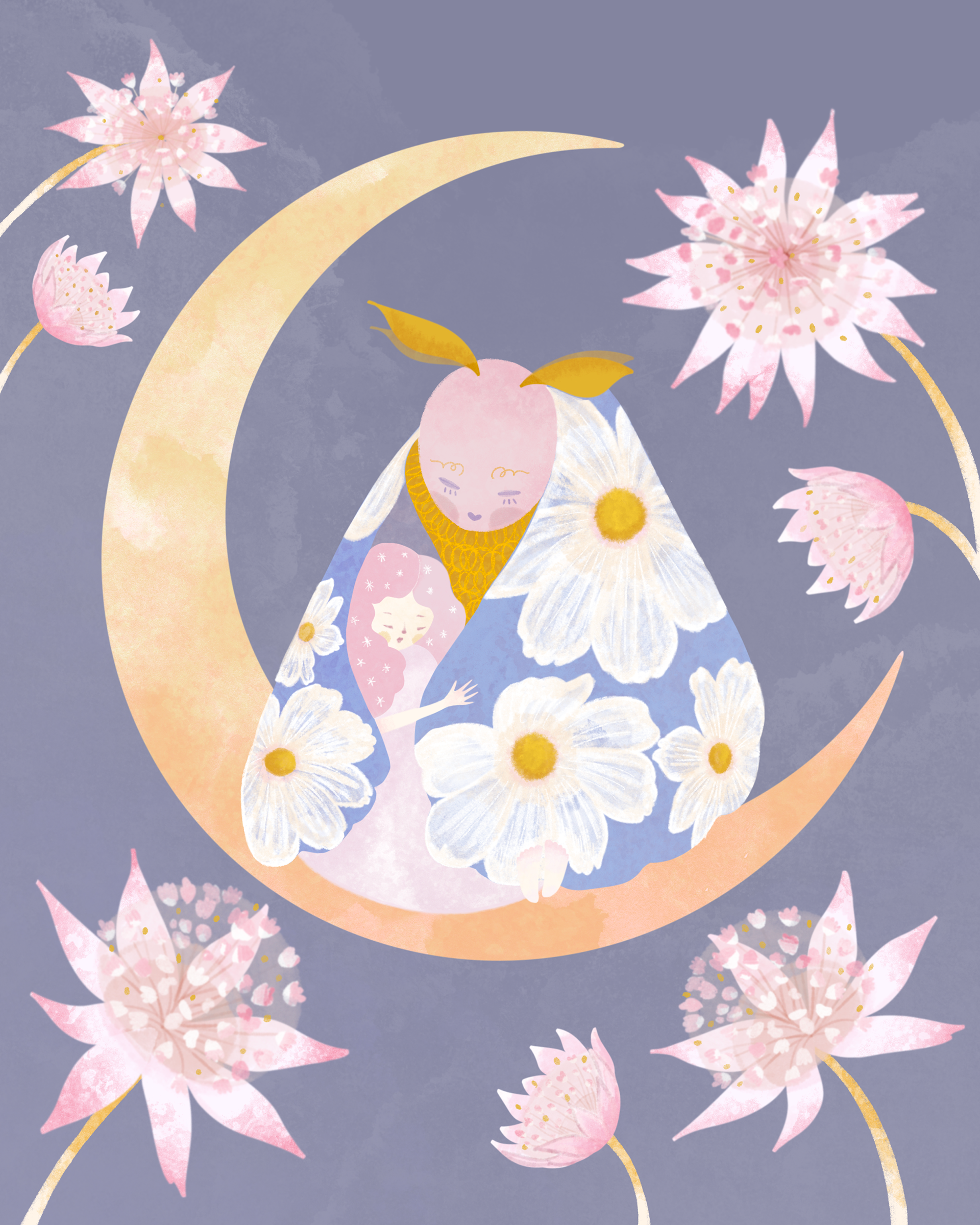
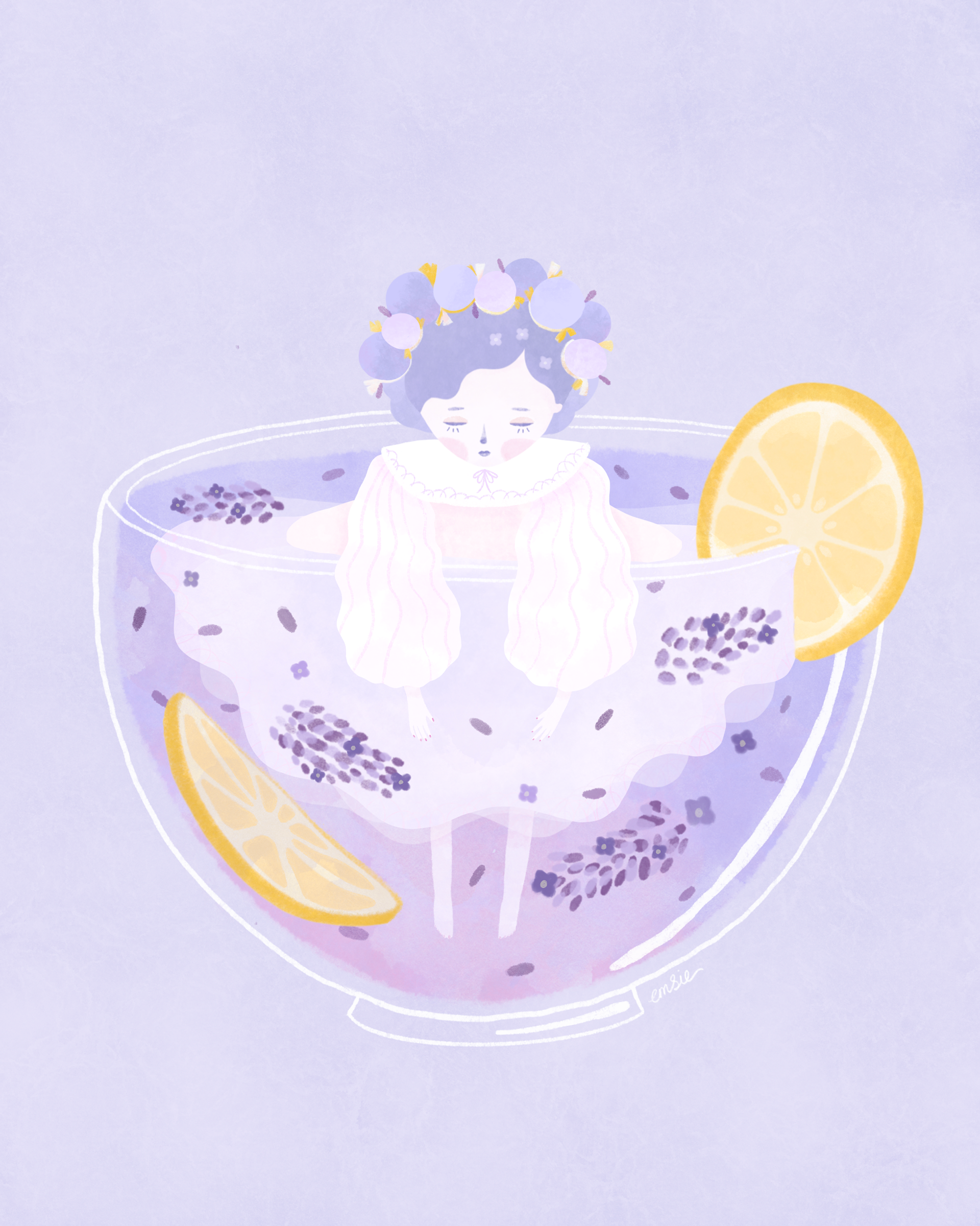
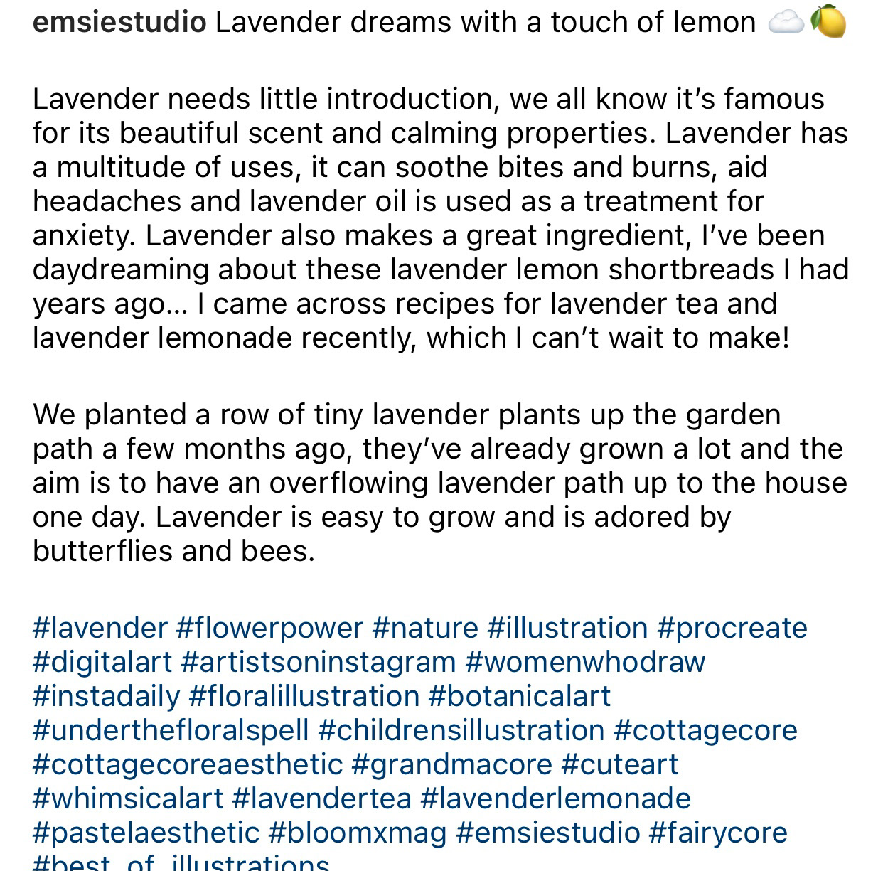
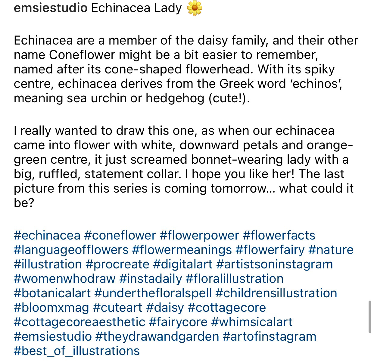
FINAL DRAWINGS & THEIR INSTAGRAM CAPTIONS
Building a researched, considered narrative around each illustration gave me something interesting to write about in the captions on social media, as a way of sharing interesting information and building a brand voice. Captioning my images in this way enabled me to share more my passion and knowledge as a florist, and strengthen Emsie's identity as a flower-centric brand. ​​​​​​​

PROJECT 2.
BOOK & CHARACTER DESIGN | ANNE OF GREEN GABLES
I feel it is very important that I integrate some commercially driven projects into my portfolio, especially as I don’t have real clients or existing client briefs to create for yet. One significant avenue for using illustration is through publishing, particularly children’s books or book covers. 
I decided from early on that I would base one of my mini projects around a book, as this would challenge me to alter my illustration style and consider the requirements and composition of book covers, as well as develop stronger character designs and more detailed scenes. 
The choice of book was important, as I wanted to select a story that contains floral themes, in keeping with this project and my brand. My decision was made when I came across the Netflix series Anne with an E, which is based on the 20th century novel, Anne of Green Gables. The story of orphaned Anne Shirley is full of floral references, and the author L.M. Montgomery writes about nature a lot throughout the book. These references also feature in the Netflix series cinematography, including cherry blossoms, dandelions and wildflowers. 
I realised also that Anne with an E has been an incredibly popular series, with dedicated fans worldwide, which provided the opportunity to gain more exposure for my brand through using a popular theme and the relevant hashtags. One of the reasons Anne with an E has been popular is that it ties in to the current trends of Cottagecore, harking back to a simpler time and with styling that suits the Cottagecore aesthetic. 

Some of my favourite Anne of Green Gables book covers I came across while researching. Almost all of the covers make use of nature and flowers, and this is something I also want to create with my own book cover.

Stills from the Netflix series Anne with an E. These would inspire my 'Anne's flower hat' and 'Kindred Spirits' illustrations. The series was a useful reference when considering how to dress the characters and the series is very visually appealing, yet overall stays quite true to the book.

My Instagram video Reel showing my Anne of Green Gables series

Having decided on Anne of Green Gables, I ideated a selection of potential illustrations. For this, I cross referenced the series and the book to find which floral elements I saw in the series are true to the book. I wanted to ideally use the book as a reference as series adaptations are rarely entirely accurate, but I didn't have time to read the entire novel, whereas I have a good knowledge of the drama adaptation. 
For example, in the Netflix series, Anne wears a hat covered in wild flowers, but in the book the hat is decorated only with wild roses and buttercups, neither of which appear on her hat in the series. These small details felt important, as I wanted to convey the contents of the book, as if I was illustrating it for real. 

Eventually I made my selection of three images to make up this mini project:

✺ ANNE'S FLOWER HAT
 "KINDRED SPIRITS" ANNE & HER FRIEND, DIANA
✺ ANNE OF GREEN GABLES BOOK COVER
✺ 1. ANNE'S FLOWER HAT 
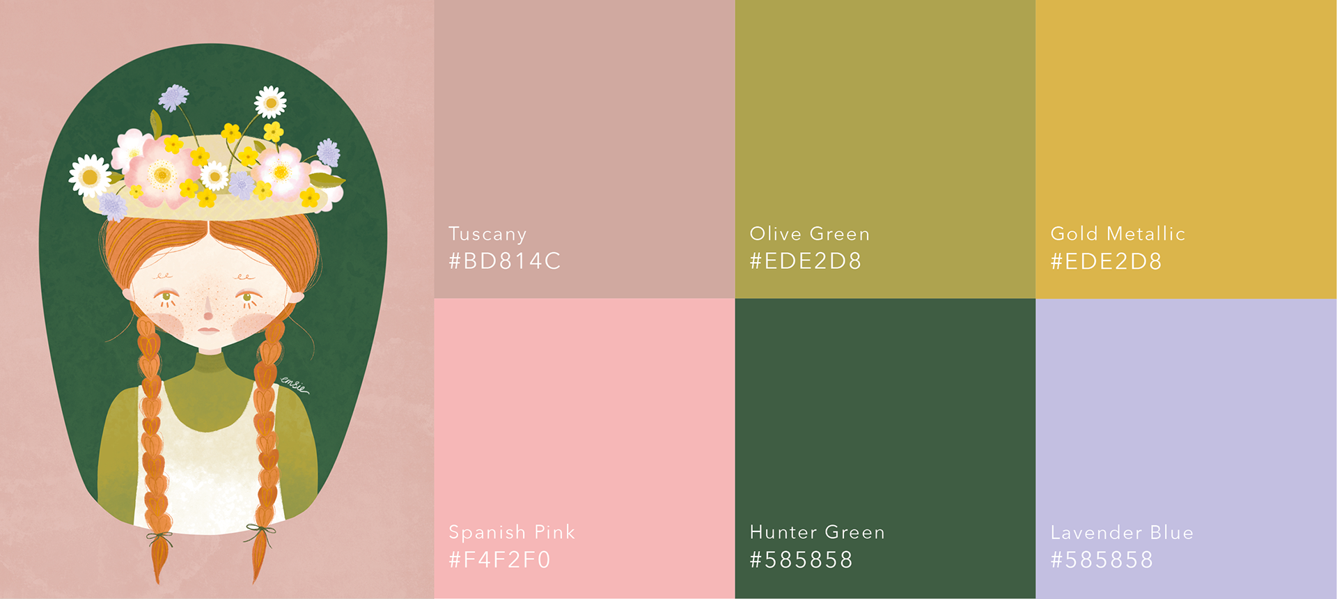
I stayed true to the book by including wild roses and buttercups in Anne's hat. However it felt far too structured and lacked the just-picked feel. I decided to add some wild flowers like scabiosa, to enhance the wild look and introduce a different colour, lilac, which would appear in the other images in this series and create unity between the images. 
The colour palette set the tone for the other illustrations in this series, making use of a variety of colours but maintaining a soft, earthy tone.
 2. 'KINDRED SPIRITS' - DIANA & ANNE 
 I wanted to challenge myself by drawing a second character, who had an entirely different appearance to Anne. This came in the form of her best friend Diana, who dresses entirely differently and has a completely different personality to Anne. 
Of the three, this illustration is mostly inspired by a scene from the series, as in the book there is no mention of dandelions, but it is an aesthetically appealing and symbolic interpretation. The illustration is named 'Kindred Spirits', as this is how Anne famously describes her friendship with Diana.
 ✺ 3. BOOK COVER & MOCK UP​​​​​​​ 
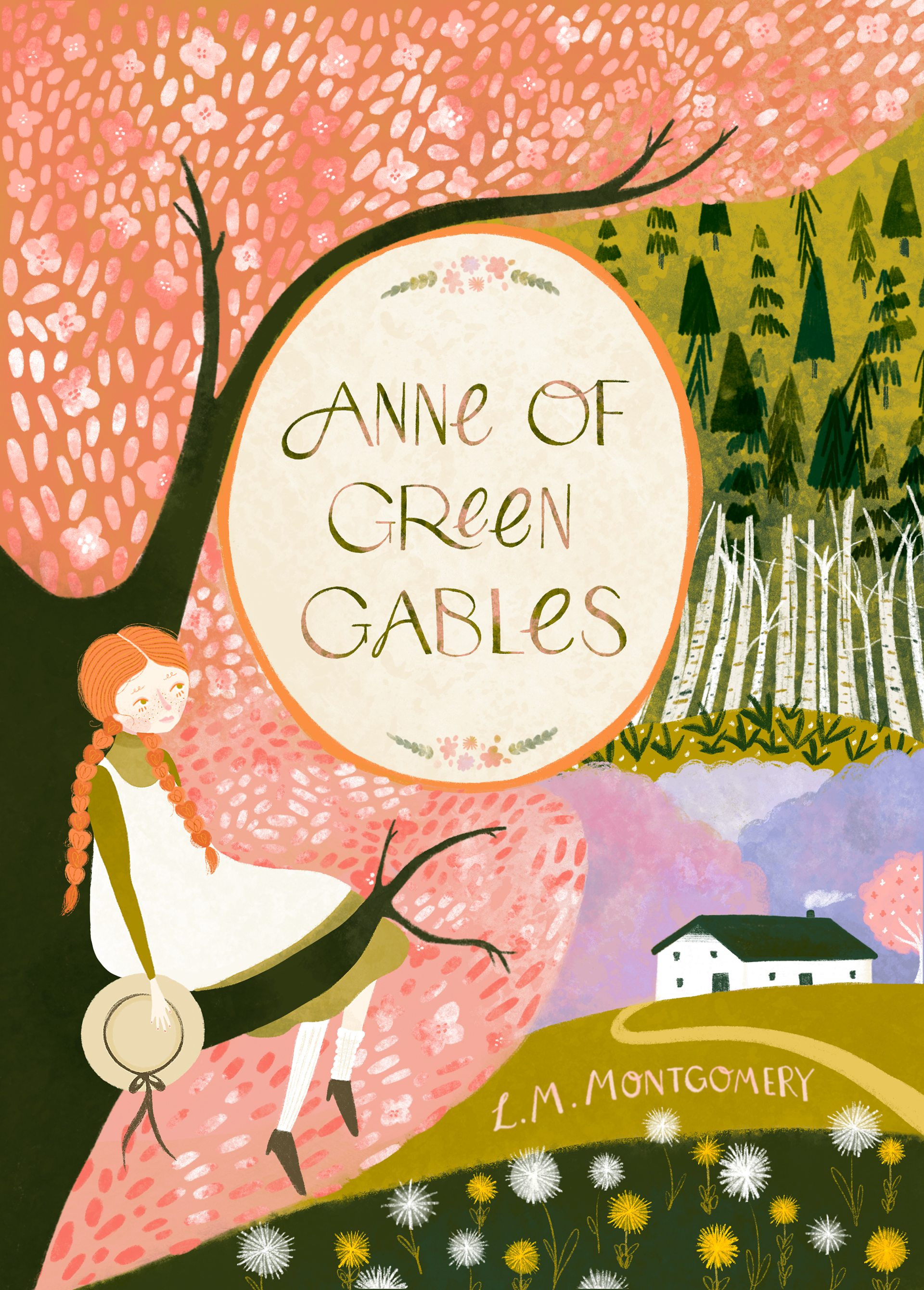
For the book cover, I relied entirely on the contents of the book. L.M Montgomery writes with such detail about Green Gables, how it looks and what grows there. 
I started by looking at existing book covers for Anne of Green Gables, and felt a little disappointed by the lack of imagination behind many of the covers. I knew that I wanted my cover to have more detail, and would pull in some direct and authentic references from the book. 
The book cover went through several iterations, as I tried to figure out where the font would be placed, how the typography would sit alongside the illustrated elements, and how much colour and detail was needed. 
For the typography, I did experiment with drawing freehand but felt this lacked the clean, legible quality that you would see on a genuine book cover. I looked at a selection of fonts from Adobe Typekit and Creative Market and based my own typography off a font that I traced and then modified in my own way. 


Left: My first iteration for the book cover. I realised while working on this I was unhappy with the scale of Anne on the cover, and was struggling to find a way of incorporating the title. Right: After scaling down Anne and the Tree, I was able to incorporate more details and textures which add to the book's visual appeal. The title could then be in an oval which would make it stand out, and give me more options for potential typography.​​​​​​​


Experimentation with a combination of hand written text and downloadable fonts. The final typography was hand drawn and based off a font found on Creative Market.


FINAL BOOK COVER & INSTAGRAM CAPTION

PROJECT 3.
REPEAT PATTERN DESIGN
✺​​​​​​​
When it comes to using design and illustration in a physical setting, such as on a product, repeating patterns are commonly used as they allows for a design to be scaled and applied to different surfaces without the artist needing to draw more than necessary. Repeat patterns are set out in a grid that ultimately creates a seamless pattern. 
Many of the brands I have looked at as part of my brand analysis utilise floral motifs in the form of a repeat pattern, on products including fashion, bed linen, wallpaper, gift wrap and stationery. 
I wanted to try making a repeat pattern as part of this project as it would be a useful exercise in understanding the pattern process, and considering ways in which my designs could be used in the future and thinking about their final context. Being able to design patterns will be an important part of my toolkit, with product design, packaging and digital platforms all making use of patterns. 
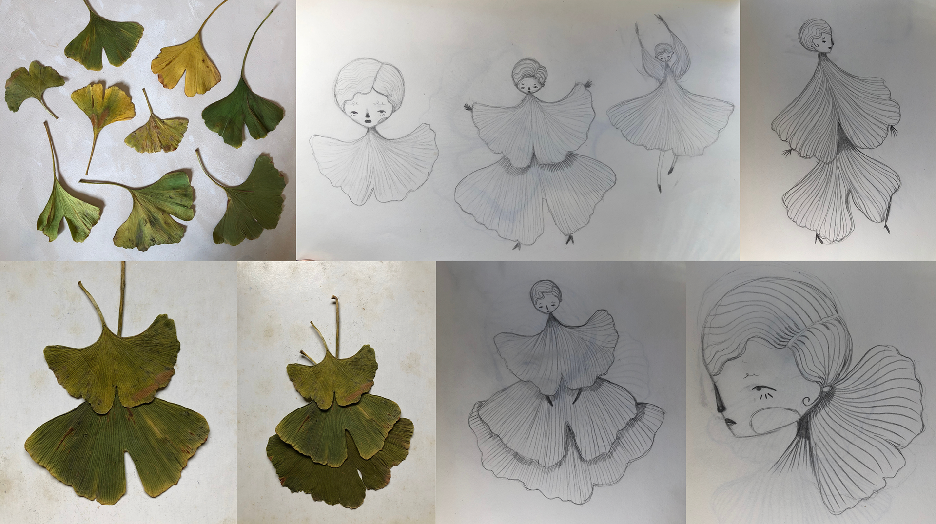
With autumn approaching, my idea for this project came during a walk to work when I came across some Ginkgo leaves on the ground. The leaves have an artistic and stylish shape that I have long admired, and it seemed like a good opportunity to utilise these leaves and create something. I pressed some leaves between the pages of my notebook to use as a reference. 
My initial ideas were to create a series of drawings using the ginkgo leaves as fashion items, as that was how the leaves looked to me at a first glance. The more I looked at their different shapes the more I could see, and I ended up with a selection of sketches of frilly dresses, billowing blouses, flared trousers, statement collars and bows. 

Video showing my ideas and sketching stage to get inspiration.

With each of these sketches working effectively in their own way, I wanted to try and use all of them, which led me to the idea of creating a repeat pattern using all the characters and leaf illustrations. ​​​​​​​

In order to get the right shape to the leaves and ensure that my illustrations were recognisable a ginkgo, I used my photographs as a reference to outline the shape.

Illustrations before final colour adjustments and shading had been applied. I wanted to keep to the earthy, monochromatic green tones to ensure all of the illustrations compliment each other and resemble the autumnal, dried leaves that inspired them.

CREATING PATTERNS
Once all the illustrations had been completed, I layered them all onto a canvas to see how they look together. I experimented with different scales and placements until I found a composition that worked well.
I then had to create the composition in a square format, in order to create the repeat pattern design. 
I created two pattern designs, one with characters and one just with leaves.
Repeat patterns require a square design that can be split into four, and then each quarter is moved to the diagonally opposite corner. This creates a pattern that can be repeated seamlessly, as demonstrated below.

Animation showing how the squares of the ginkgo pattern stitch together to make a repeat pattern.

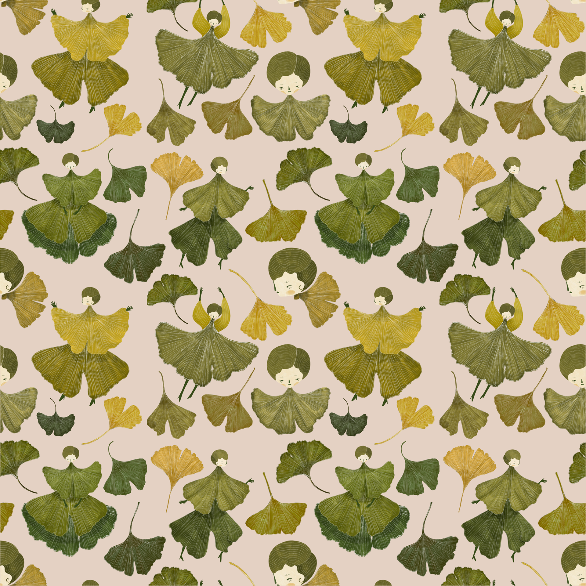
FINAL REPEAT PATTERNS
Along with the repeat pattern, below is a variety of compositions that may work as printed goods such as greetings cards or wall art prints. Feedback and social media content for this project can be viewed under the 'Social Media Strategy & Website' tab. ​​​​​​​
​​​​​
PROJECT 4.
MIXED MEDIA: DIGITAL COLLAGE
Breaking away from pure illustration, I wanted to be able to demonstrate my other disciplines in photography and floristry and see how I can combine these different mediums. 
The Green Gallery share digital collages to their social media, layering images of a similar theme and colour palette to create an engaging and visually appealing graphic. While The Green Gallery create their imagery with a compilation of secondary images, I wanted to use all my own imagery to create my collage. 

Photographs of my floral arrangements were taken, and then cleaned up in Photoshop. Colours were softened and the pink intensified to compliment the illustrations.
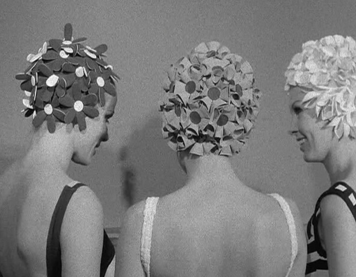

I took all my own photos of my floral arrangements, as well as photographing separate elements like the Hydrangea against a plain background to be cut out using Photoshop. I planned out my frames using Photoshop, before importing the elements into Procreate and making the animation there, as it offered me greater flexibility and more instant results to see how the animation will look on social media. I could also colour correct and make alterations based on how the illustrations themselves were looking when placed alongside the different visual textures of a photograph. ​​​​​​​

For my illustrations, I focussed on the hydrangea in the photos. Thinking about it, the hydrangea reminded me of flowery vintage swim caps, so I decided to theme my characters around swimwear. I also experiment with a different form of figure to diversify my style and create something more inclusive and playful.
I also used the Symmetry feature on Procreate for one of these illustrations for the first time, which allows you to create a mirror image of your drawing and made a clean, stylish and perfectly symmetrical figure, as well as speeding up the drawing process. I referred to the photographs when making colour choices.

The hydrangea 'swim caps' were created through layering individually drawn hydrangea petals into the right shape. 

I had pressed some hydrangea petals which really helped me when recreating their form. This design could then be duplicated across my characters and altered to suit each illustration.

Overall I am happy with this first attempt at a digital collage and I think it is a good way to combine different mediums to create content for social media. 
Of all the works posted to Instagram, this collage was the least liked/commented, though I am unsure as to whether this is due to my audiences preferences towards just the illustrations alone, or if it is more to do with the algorithm on Instagram at the time of posting. This can be quite frustrating as your audience doesn’t always see your posts on their feed and some posts just don’t get as much attention as others.

Final digital collage in the form of a GIF


PROJECT 5.
RHS CHELSEA FLOWER SHOW
✺​​​​​​​
To conclude my mini projects, I wanted to make the most of an important date in the floral calendar- the RHS Chelsea Flower Show. Due to the pandemic, the show took place in September, rather than its usual date of May, giving me the opportunity to create some content that utilises the enhanced public interest in flowers and gardens, and use the relevant hashtags that are active during the show. 
As well the Chelsea Flower Show, shops and businesses in Chelsea take part in Chelsea in Bloom, where every year a new theme is selected and shops decorate their windows and exteriors with elaborate floral installations. 
Initially I wanted to create a poster design for the Chelsea Flower Show, however with time constraints and a lack of confidence in typography, I felt that it would be best to instead focus on illustration and animation to conclude these mini projects, as there was much to do during this final week. 
To get inspired, I went to look at some of the installations for Chelsea In Bloom, and noted the theme for this year is ‘Extraordinary Voyages’. Popular themes included dried flowers (due to the time of year), and golden age of travel such as hot air balloons and exotic animals. Chelsea In Bloom provided a more specific brief for me to work with, and so I decided to base my final mini project around this, utilising the hashtags #RHSchelsea and #chelseainbloom.
I also attended an exhibition at the near-by Saatchi Gallery, RHS Botanical Illustration and Photography, to see if this would provide further inspiration for not just this project but building my portfolio in the future. 
Evidence of this exhibition can be seen in the 'Research & Development' tab. ​​​​​​​​​​​​​​

Photos taken of some floral displays for Chelsea In Bloom. Autumnal, dried flowers were a recurring theme, neutral palette and modes of transport like hot air balloons and boats to fit the 'Extraordinary Voyages' brief.

I felt that these first illustrations were far too simplistic and childish, and wouldn’t appeal to the more mature audiences who will be looking at this event. Instead, I modified the designs and focused on the plane and hot air balloon ideas. 
Thinking of the approaching autumn, and the use of dried flowers this year, I changed the designs to incorporate a warmer colour palette of browns, reds and oranges, rather than pastels, and thought about some varieties of dried flower that could be incorporated into the designs. ​​​​​​​

FINAL ILLUSTRATIONS

Simple animated illustration by Chinese artist, Oamul Lu.
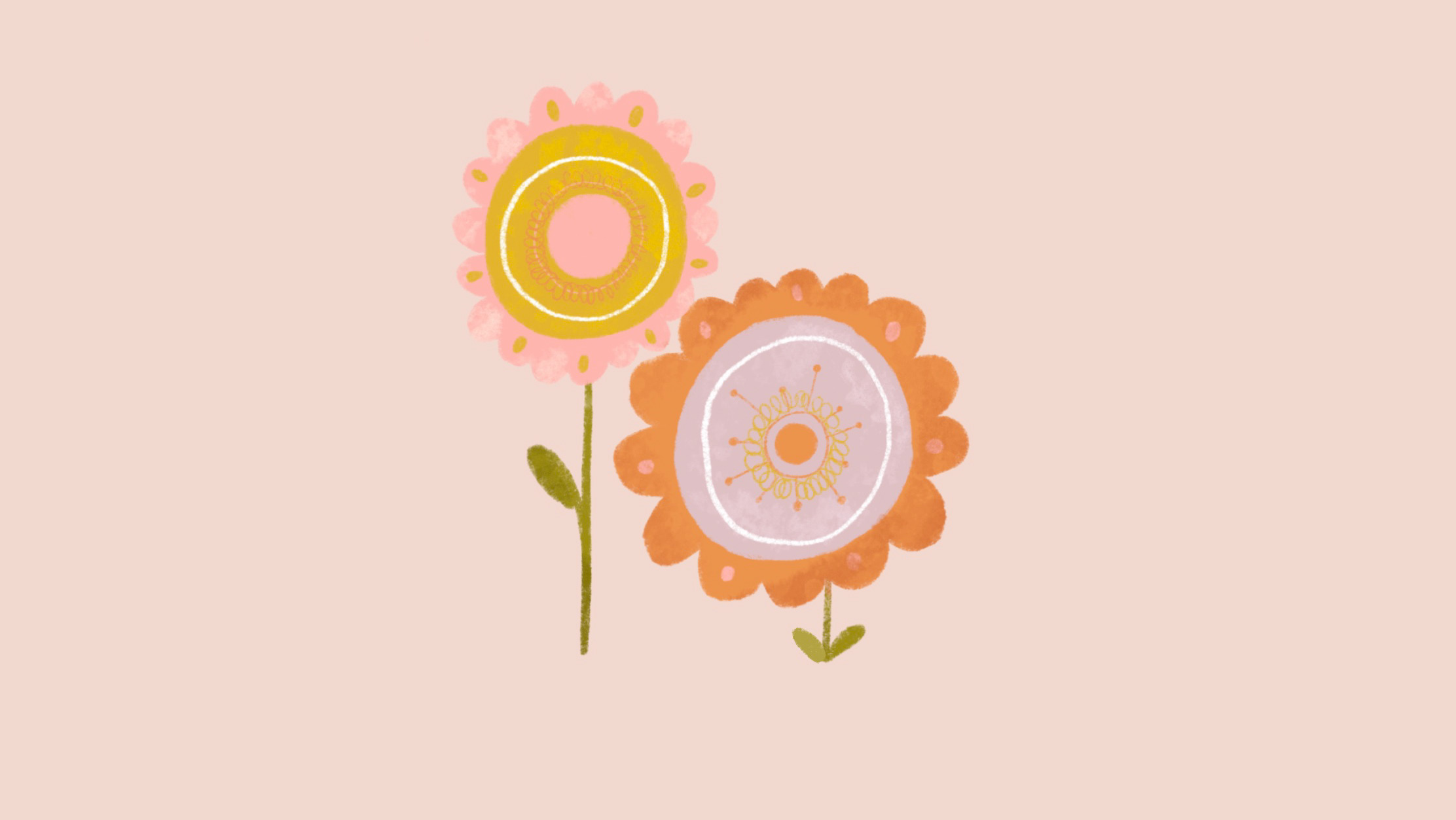
Poppy seed heads are my favourite autumnal dried flower, and I found its unique shape worked well to create the shape of the hot air balloon. 
The artist Oamul Lu (left) inspired these images, as he has created animated illustrations that still appeal to adults, while maintaining an innocent and naïve quality. 
FOR MORE EVIDENCE OF CREATIVE MINI PROJECTS, I HAVE UPLOADED ALL FILES TO GOOGLE DRIVE, ACCESSIBLE BY THE BUTTONS BELOW.


 CLICK FOR THE NEXT PART OF THIS PROJECT:

You may also like

Back to Top